
Most interior designers will tell you that the colour scheme of any hospitality space is supremely important. Colour sets the theme and has a big effect on how customers feel and even act, when they come into your hotel or restaurant. Traditionally, colour schemes have been neutral to allow for a change in the colours of accessories such as furniture and soft furnishings without the need to repaint the walls and ceilings.
However, repainting will be needed eventually to freshen up the area and make it look like new again, so that is the ideal time to get trendy with a new colour scheme. First off, you have to think about what kind of customers come into your establishment and how you want them to behave.
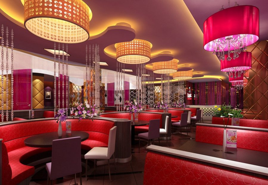
Colours for a restaurant
For instance, a restaurant it is all about eating, so you want your customers to order fine meals and eat heartily. While they should be relaxed to enjoy the meal, they should also be energised enough to feel hungry. Colours that are energetic should be used; yellow, red and orange are stimulating colours that will enliven the atmosphere, encourage social interaction and stimulate appetites.
Of course, you don’t have to paint everything in such colours, but adding them in accessories or furnishings will give the place a bit of bright energy that guests will find enjoyable.
Colours for a hotel
But for a hotel room, it is more about relaxation after a meal. You want guests to be relaxed and sleep well, so the colours should be those that enhance calm relaxation, such as light blue, greens and even mauves.
Pale colours can be brightened with some richer ones, but still in the same hues. Adding a rich turquoise to paler blue or green can make an amazing difference without causing guests to feel energetic or restless.
Natural not neutral
Natural colours blend in well with rich hues and also with brighter colours, which is why so many establishments seem to use them. However, natural colours are not so much neutral colours. You can have ochre and moss green, along with sand and ocean aqua as natural colours that everyone will appreciate.
Mixing and matching colours is trendy now, so don’t just stick to one colour, which can be boring. It needs to be broken up with both contrasting and toning colours for the best results.
Why space is important
Space is another important factor in choosing colour. If a room is small those warm, vibrant colours may make it feel claustrophobic. A larger more spacious room where calm blues or greens are used can feel a bit stark unless you also use a few warmer colours in there.
Choosing a colour scheme is not difficult once you remember these simple facts.